
Color Palettes That Sell: Mastering Carton Box Packaging
The Importance of Color in Product Packaging Solutions
Color is a powerful tool that shapes perception and drives purchasing decisions. Research shows that 93% of buyers prioritize visual appearance, and 80% of brand recognition is directly tied to color. From fast-food chains using red to spark urgency to health brands adopting green for its wellness associations, the strategic use of color is integral to business success. For packaging converters and paperboard box suppliers like Meyers, who specialize in sustainable printing solutions, applying the right colors to carton box packaging can transform a product from being overlooked to becoming unforgettable in a crowded market. This leads us to a crucial aspect of color’s impact: its ability to evoke emotions and reflect cultural cues, shaping how consumers perceive and connect with brands.
Understanding Color Psychology in Custom Packaging Design
The emotional power of color goes beyond surface appeal, tapping into deeper psychological and cultural realms. By understanding how colors evoke feelings and convey meanings across different contexts, brands can craft compelling stories that resonate on an emotional level. This section explores the intricate connections between color, emotion, and cultural significance, offering insights to help brands create lasting impressions.
The Impact of Color and Emotion in Packaging
Colors play a pivotal role in custom packaging design, including folding cartons tapping into human psychology to influence emotions and behaviors in profound ways. They serve as a silent language that conveys specific messages and evokes targeted feelings. For instance, red symbolizes urgency, passion, and excitement, making it a go-to choice for clearance sales or high-energy brands eager to grab attention. Blue, in contrast, exudes trust and calm, making it a favorite for financial institutions and tech companies seeking to establish reliability. Additionally, yellow represents optimism and energy, a perfect fit for brands aiming to uplift and inspire. Every hue tells a story—one that shapes how consumers perceive and engage with brands, turning mere visuals into meaningful connections.
Cultural Contexts in Color
Color meanings vary widely across cultures, reflecting diverse traditions and values. For example, red is celebrated as a symbol of good fortune and joy in China, often used in weddings and festivals to convey happiness and prosperity. In contrast, the same color frequently signals caution or danger in Western societies, such as in traffic lights or warning labels. Similarly, white, which often symbolizes purity and new beginnings in Western contexts like weddings, can represent mourning and loss in other parts of the world, such as in East Asia. These stark contrasts underline the importance of cultural awareness in color choices. To authentically connect with global audiences, brands must carefully consider these cultural nuances when developing product packaging solutions, crafting custom packaging designs that respect and resonate with their target markets.
Emotional and Cultural Relevance
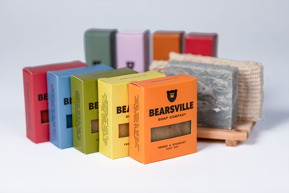
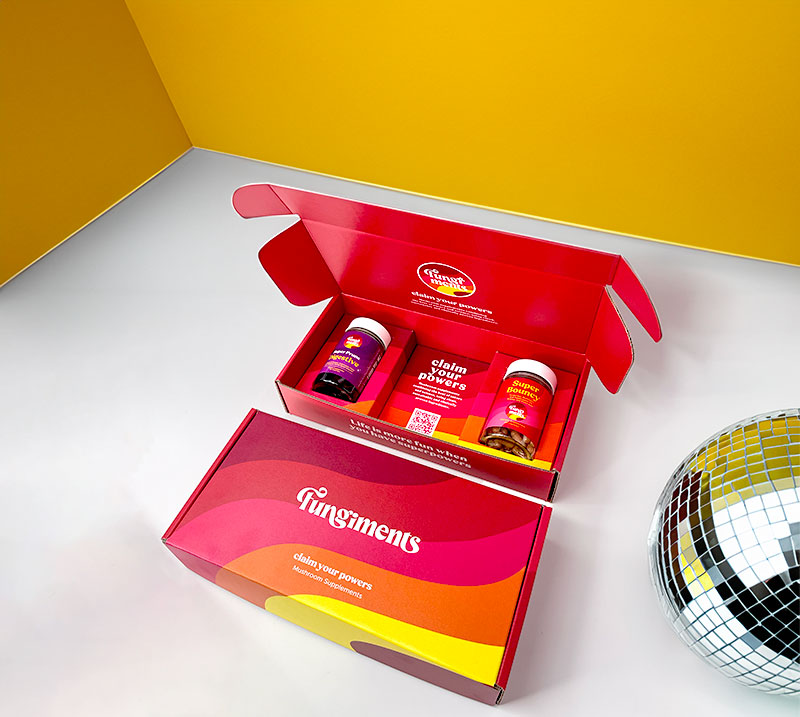
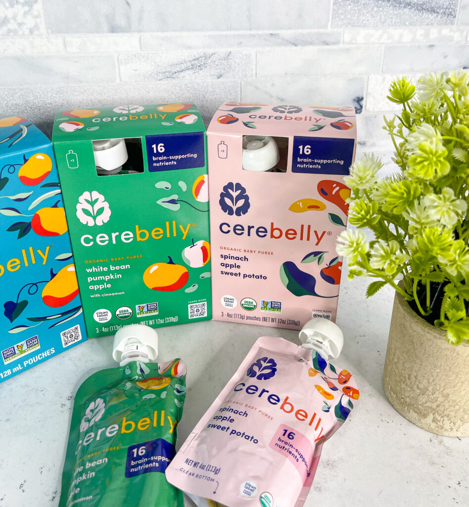
Custom packaging designs that resonate emotionally and culturally forge stronger connections by aligning aesthetics with audience values. Retail color psychology plays a crucial role in this process, as colors influence perceptions and emotions. For instance, soft pastels are commonly used in cosmetic packaging to evoke sophistication and delicacy, creating an air of elegance that appeals to their target market. Bold, vibrant hues like red and yellow are often used for snack and beverage packaging to convey energy, excitement, and appetite appeal. Similarly, eco-friendly products lean on earthy tones, such as greens and browns, to emphasize sustainability and authenticity. By blending these emotional cues with cultural relevance, brands can create decorative paperboard boxes that not only capture attention but also build trust and loyalty. This thoughtful approach ensures that your packaging doesn’t just look good but feels meaningful to your audience, making a lasting impact in the retail space.
Strategic Color Choices for Decorative Paperboard Boxes
Aligning Carton Box Packaging with Brand Identity
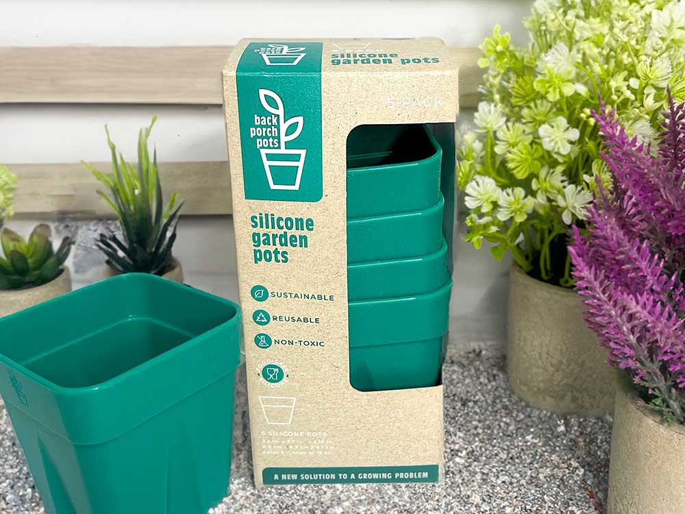
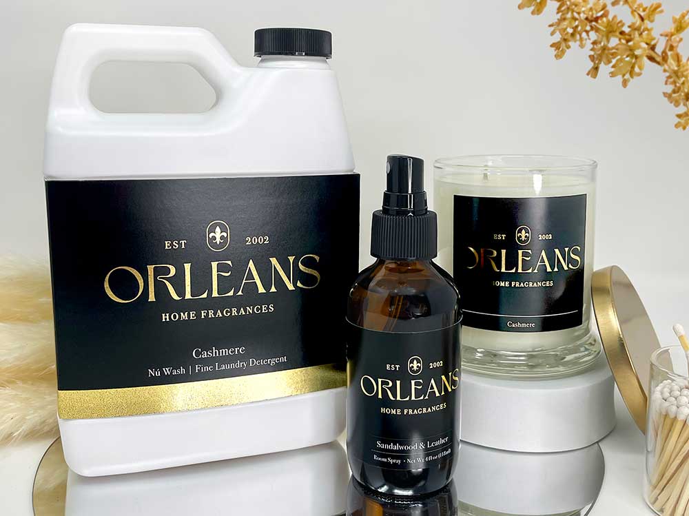
Your color palette should reflect your brand’s mission and values, serving as a visual shorthand for your core principles. For example, Meyers uses green hues to highlight its commitment to sustainability and environmental responsibility. These shades not only align with eco-conscious messaging but also signal growth and harmony to consumers. Likewise, custom packaging boxes often incorporate earthy tones like brown and beige, reinforcing the eco-friendly narrative while preserving an air of sophistication and luxury. Carefully selected colors ensure your packaging conveys authenticity and resonates with the right emotions in your target audience.
Industry-Specific Trends
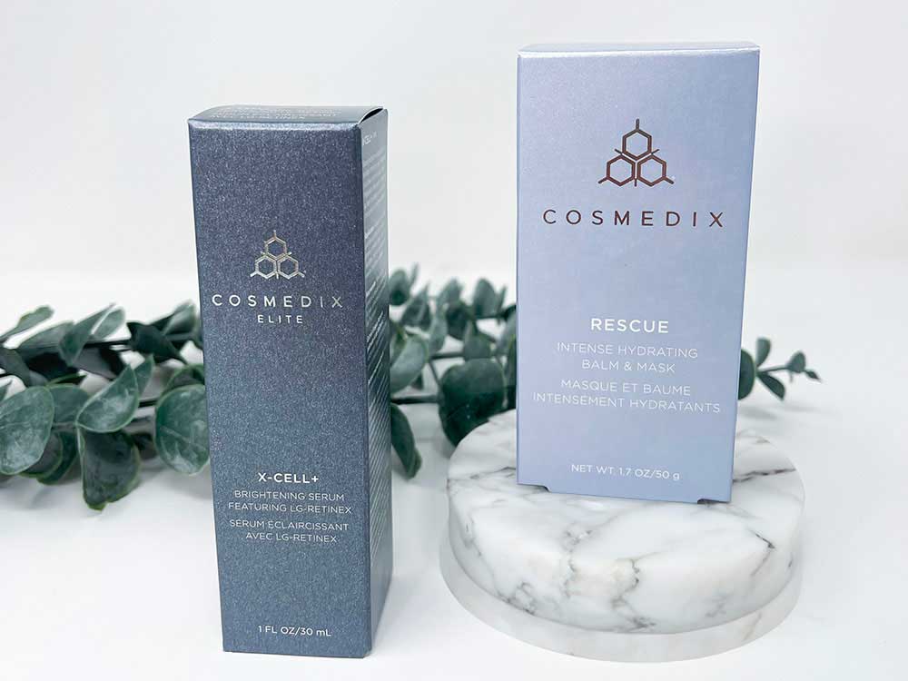
Different industries have unique color preferences that reflect their core values and target audience expectations. Luxury brands, for instance, gravitate toward black and gold, colors that exude exclusivity, sophistication, and timeless elegance. These hues help communicate a sense of premium quality, appealing to affluent consumers. On the other hand, tech companies often favor shades of blue, a color that symbolizes reliability, trust, and innovation—qualities essential for building confidence in digital and technical solutions. When applied to carton box packaging, these color choices not only enhance visual appeal but also ensure the packaging aligns with industry trends and consumer expectations, reinforcing your brand’s position in the market.
Testing and Refining Palettes
Color testing is critical to crafting an effective visual strategy. Using tools like A/B testing, brands can assess consumer reactions to different palettes, uncovering the shades and combinations that resonate most. For instance, a bold red accent on carton box packaging might spark urgency and drive impulse purchases, while a calming blue palette could attract consumers seeking reliability. This data-driven approach empowers brands to refine their designs, ensuring they not only capture attention but also align with the emotions and preferences of their target audience.
Effective Strategies for Applying Color Psychology in Custom Packaging Boxes
Custom Packaging Design for Maximum Impact
Packaging is often the first interaction consumers have with a brand, serving as a critical touchpoint for shaping perceptions. Vibrant or contrasting colors are particularly effective at standing out on crowded shelves, capturing attention and driving impulse purchases. For instance, custom packaging boxes with bold patterns and striking color combinations not only reinforce brand identity but also create a memorable visual impact. The connection between packaging and consumer behavior is undeniable, as thoughtfully designed product packaging solutions can influence purchasing decisions, build brand loyalty, and create lasting consumer engagement.
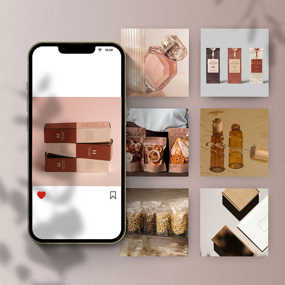
Digital Presence and Social Media
Online, cohesive color palettes significantly enhance visibility and engagement, serving as a key driver of brand recognition in the digital age. Platforms like Instagram, which thrive on visually appealing content, make it crucial for companies offering product packaging solutions to maintain a consistent and attractive aesthetic. For instance, using complementary colors on decorative paperboard boxes creates a harmonious and visually pleasing look that draws attention and resonates with audiences. Thoughtfully curated feeds showcasing these designs not only strengthen brand identity but also encourage higher consumer interaction and loyalty.
Seasonal and Promotional Color Strategies in Custom Packaging
Adapt color strategies to align with seasonal themes or promotional campaigns, enhancing relevance and emotional appeal. Warm tones like oranges and yellows evoke the energy and vibrancy of summer, perfectly suited for seasonal product launches or outdoor events. Cooler hues such as blues and silvers capture the serene and cozy atmosphere of winter, ideal for holiday branding. For instance, paperboard box suppliers can integrate festive red and green combinations during the holiday season, tapping into traditions and creating an emotional connection with consumers.
Harnessing the Power of Color
From driving emotional connections to reinforcing brand identity, Color Psychology is a cornerstone of effective packaging and branding strategies. It acts as a silent communicator, bridging the gap between visual aesthetics and emotional resonance. Whether it’s leveraging industry norms to meet consumer expectations or innovating with seasonal palettes to add freshness, color choices play a pivotal role in capturing attention. When applied to carton box packaging, these strategies can elevate the unboxing experience, enhance brand perception, and make a lasting impression on consumers. Thoughtfully curated color strategies are an essential tool for driving engagement and increasing sales.
As digital platforms and technologies evolve, dynamic and responsive color strategies are becoming more essential for staying competitive. These strategies not only adapt to shifting consumer preferences but also leverage emerging tools to create deeper connections. Innovations like interactive packaging, such as augmented reality features on decorative paperboard boxes, allow brands to engage consumers in new, immersive ways. By combining technology with color psychology, businesses can craft experiences that captivate audiences, enhance brand loyalty, and drive long-term growth in an ever-changing marketplace.
Evaluating Your Product Packaging
Evaluate your brand’s color palette. Does it truly reflect your values, captivate your audience, and drive sales? Color is more than decoration; it’s a strategic tool that shapes perception and builds trust. With over 70 years of expertise in sustainable solutions, Meyers is more than a paperboard box supplier—we specialize in creating personalized experiences and custom packaging boxes that stand out while forging meaningful connections. Let us help you craft packaging that not only draws attention but also inspires loyalty and delivers measurable results in today’s competitive marketplace.
Meyers creates folding carton packaging and labels that help shape a better future for people, products, and the planet. Trusted by leading brands like Hormel, Ulta Beauty, and Microsoft, Meyers combines innovation with a commitment to sustainability. Contact us today to learn more.